Do logos need to be accessible and meet the WCAG accessibility requirements? The answer will surprise you! Find out how to make your logo designs more accessible and reach a wider audience and how that helps your branding work.
Music: https://www.bensound.com
Hi and thanks for tuning in. I’m Colleen Gratzer and in this episode of Design Domination, I’m answering the question, Do logos need to be accessible? Do logo designs need to meet accessibility requirements?
Stick around, because the answer will surprise you!
What Accessibility Guidelines Say About Logos
If you’ve spent any time perusing the accessibility guidelines—WCAG—then you may have noticed that 1.4.3 Contrast (Minimum) for level AA says that text must have a certain contrast ratio with its background, with an exception being logos.
Another guideline, 1.4.11, has to do with non-text contrast. Non-text elements are those that are considered meaningful, as opposed to decorative. Examples of non-text elements could be a search icon in place of the word “Search” or a social media icon.
This guideline calls for non-text elements to have a minimum contrast ratio of 3 to 1 against their backgrounds.
Again, though, logos are exempt here. That’s because a logo has a specific visual representation for a brand.
Why You Should Make Logos More Accessible
Having said all that, I will now say this…
The accessibility guidelines are just that—guidelines. Following them does not guarantee accessibility either.
Logos are a prime example of something we can make more accessible by going beyond what is suggested by WCAG.
Think about this…
If a logo includes a brand name or tagline that don’t have sufficient contrast against the background they appear on, then the words may be hard, if not impossible, for individuals with certain visual disabilities to read.
If a logo contains non-text elements that do not have sufficient contrast with their background, then those same individuals may not be able to see them.
The design of a logo is really important for people to recognize it.
In fact, I looked up a few things. Here is an interesting scientific stat mentioned in a PubMed article:
Research at 3M Corporation concluded that humans process visual data 60,000 times faster than text.
The article also mentioned a statement by Dr. Lynell Burmark, a visual literacy expert:
Words are processed by our short-term memory which can only retain about 7 bits of data. Images, on the other hand, go directly into long-term memory where they are indelibly etched.
So we recognize images faster than reading words. We can recognize a logo by its artwork (a shape, icon or another type of non-text element)—even the colors—immediately, before reading the text that’s part of it.
Examples of Low-contrast Logos
Why does this matter? Let’s take a look at a few examples…
Here’s a coconut oil jar with a Vitacost logo in yellow on a white background.

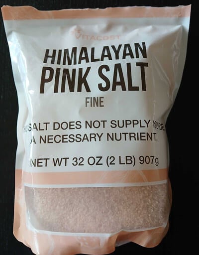
The logo is nowhere else to be found on this particular product. Same for their Himalayan salt package, which uses a light salmon color on white.

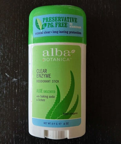
How about this Alba deodorant? The logo is white on light green.

So if someone cannot see the logo to read it or recognize it by how it looks, because of the lack of contrast, then how will you know which brand it is?
You might think this is all taking things too far. You could argue that, well, you know what the package design looks like, so you could find it if you want to buy it again. But what if they change their package design?
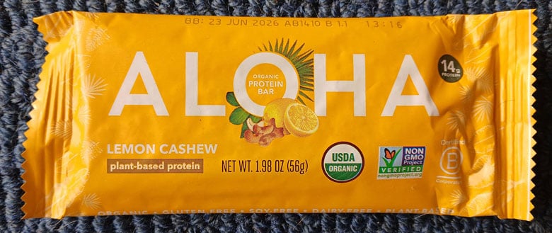
How about this protein bar? The Aloha logo is white on a yellow background.


This also gives us an example of low contrast for non-text elements—the Certified B Corporation symbol.
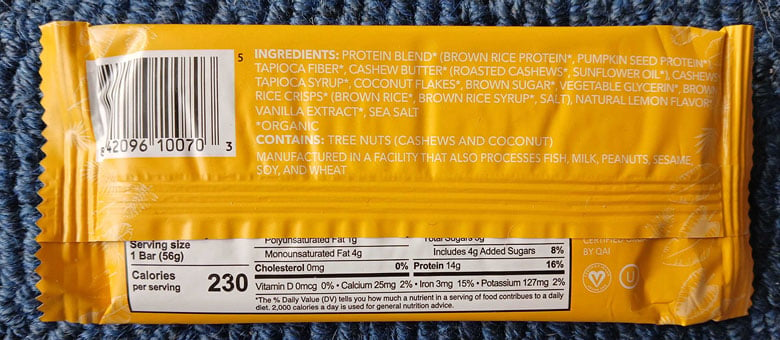
On the back, I don’t know who at all could read this ingredients list, especially being small in size and in all caps on top of that…
But there are also low-contrast symbols signifying that the product is vegan and kosher. That’s important information for a lot of people! If they don’t see that at all because of a visual disability or they don’t take time to carefully inspect the package to even come across it, they will likely move onto the next product that they are absolutely sure is indeed vegan or kosher.
It’s that simple.
Accessible Logo Design
So I want to leave you with two thoughts…
- How successful is a logo design if it cannot be read or recognized by a good percentage of people in the audience?
- How much more successful is a logo design that is more readable and recognizable by everyone, that doesn’t rely on someone’s visual ability?
Free Take the Cake Summit for Women in Design
If you want to learn more about how accessibility affects branding, check out my talk at the free online Take the Cake Summit (affiliate link) by Designer Boss, coming up November 5 and 6.
This free two-day online summit is all about helping women in design stop settling for crumbs and finally take the whole cake.
You’ll hear from 25 expert women in design sharing juicy behind-the-scenes business lessons. You’ll also get live Q&As and panel chats about pricing, mindset, branding and balance, and, of course, my session on accessibility and how it relates to branding and also your business.
Then there’s also the optional Boss Bundle, which includes over $2,000 worth of different resources, goodies, templates and bonuses from the speakers. If you decide to upgrade to get the Boss Bundle and you use my link, then I will get a few bucks for referring you. Using that link doesn’t affect what you pay. It just rewards me for, you know, telling you about it and you using it. I hope to see you there!
Isn’t the Creative Boost logo in white on a too low contrast orange an example of what you are showing as a not-to-do here?
Hi, Ben. Logos don’t technically *have to* meet contrast requirements but it’s good for marketing and for business. In the case of a website, a user already knows which website they are on. On marketing shelves, though, having a logo that meets contract requirements will help consumers find it. So it’s something to consider based on the context.